Data Stories

Summarizing the U.S. Presidential Election Day 2016 (Pacific Vis Storytelling Contest 2017)
Chris Bryan, Keshav Dasu, Sravya Divakarla, and Kwan-Liu Ma
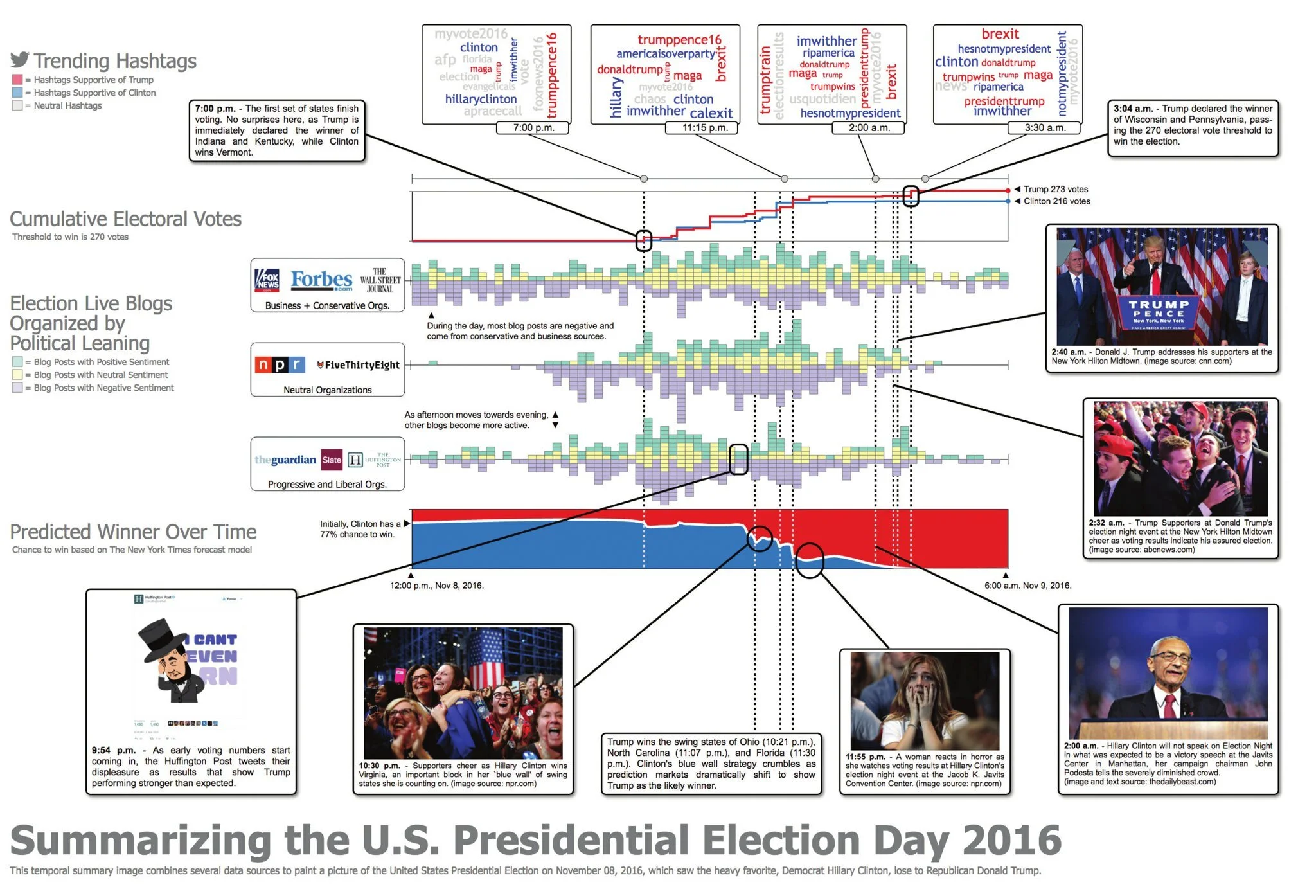
Temporal Summary Images (TSIs) were introduced at InfoVis 2016 as an approach for complex dataset summarization and narrative storytelling. We use this framework, which combines small multiples with linked time-dependent visualizations and overlaid annotations, to build a data-driven infographic of the U.S. presidential election day– November 08, 2016. The result uses several online data sources: hashtags extracted from over twelve million tweets, electoral college results, predicted winner forecasting, and blog posts scraped from the election live blogs of several news organizations. Blog sources are grouped by political bias and sentiment analysis has been applied to their posts. Annotations provide additional context about the data streams and highlight important temporal events throughout the night. By combining automatic data generation and layout with manual refinement and visual design, TSIs allowed for a streamlined design in producing presentation-quality graphics.

Disease associations in male and female 30-39 year olds. The visualization shows that mental disorders have a strong and varied association for each disease category from the length and fluctuation of the flagella. On the other hand, infectious and parasitic diseases do not; they have a larger amount of diseases with associations than mental diseases. This is indicated by the size of the capsule. Furthermore, we can see that diseases of the digestive system have stronger associations to mental disorders (indicated by the longer length of the orange flagellum) when compared to that of other disease categories.
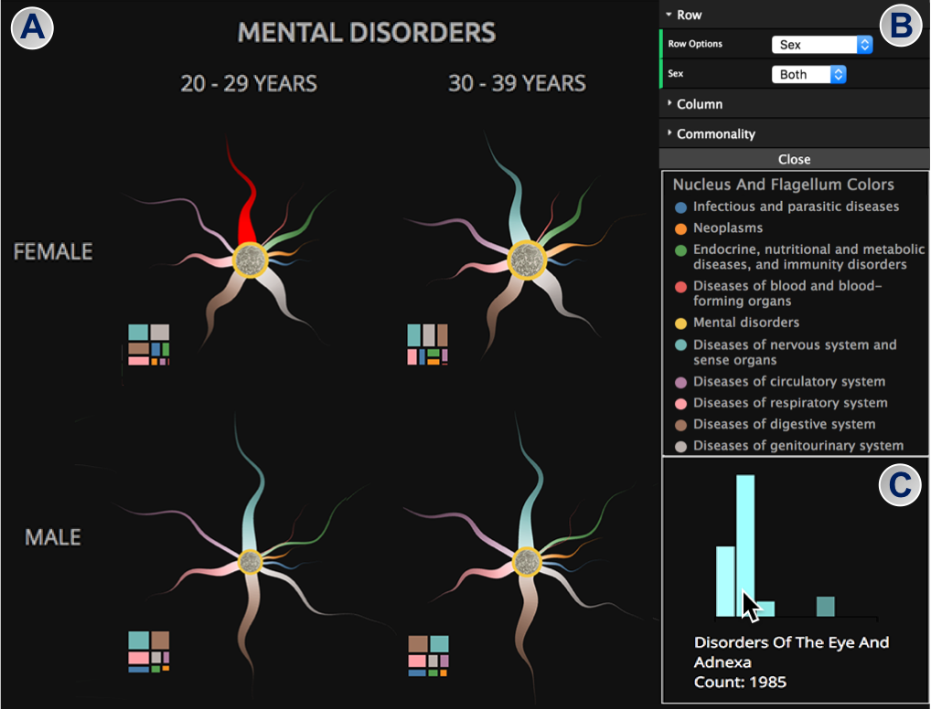
Example of given (A) patients that have mental disorders we can see several visualizations show what disease co-occur, in this case we select for Females 20-29 and examine disease of the nervous system and sense organs. We find in (C) that the most common diseases of nervous and sense also have disorders of the eye.
Learning About Disease Associations in Taiwan (Pacific Vis Storytelling Contest 2018) (Honorable mention)
Keshav Dasu, Sandra Bae, Takanori Fuijiwara, Kwan-Liu Ma
We analyzed the data from Taiwan’s National Health Insurance Research Database (NHIRDB). It is stratified into ten age groups, and for each group, the likelihood of a disease contracted from each of the other diseases is calculated. We depict disease associations among the studied subjects by designing a visualization that allows us to answer questions, such as ‘If I have heart failure what else am I susceptible to?’ and ‘How does age play a role?’ Our visualization is modeled after a salmonella bacteria cell based on. This visualization illustrates the co-occurrence of diseases. The capsule size denotes the number of diseases that are associated. Each flagellum represents another disease category. The longer length of the flagellum represents a stronger association. Flagellum thickness represents the number of diseases with the same association at a given point. Fluctuation of a flagellum shows variation in the strength of association. (View our presentation at https://k-dasu.github.io)
*This work was later extended into a short paper at VIS 2018.
K. Dasu, T. Fujiwara and K. Ma, "An Organic Visual Metaphor for Public Understanding of Conditional Co-occurrences," 2018 IEEE Scientific Visualization Conference (SciVis), 2018, pp. 1-5, DOI: 10.1109/SciVis.2018.8823624.

Species diversity, species abundance, wind direction, and chlorophyll associations in the San Francisco Bay Area for 2015. The visualization on the left shows that the interaction of a warm water mass with high chlorophyll levels led to an increase in species diversity. On the right, these changes show how the population of gelatinous plankton increased while the number of krill decreased, showing a shift in the food web.
Periodic Temperature Effects on Biodiversity (Pacific Vis Storytelling Contest 2019)
Keshav Dasu, Paulina Lei, Erin Satterthwaite, Elliott Hazen, Jarrod Santora, Kwan-Liu Ma
The National Oceanic and Atmospheric Administration (NOAA) collects near real-time data on the oceans and atmosphere. We analyzed this data in the region spanning from the Monterey Bay up to the San Francisco Bay Area in the United States from 2009 to 2015 and created a visualization to help illustrate the relationship between climate and biodiversity to the public. We designed a glyph, inspired by Slingsby’s work, to represent chlorophyll volume, wind direction, and species diversity. Our glyph is applied to a tile-map of the region, where tile color is sea surface temperature. The implementation of the glyph and tile-map was done using Three and exported as images. Using Photoshop we manually illustrated species abundance data. The combination of our glyph and our tile-map allows us to better see how these variables influence one another and shed light on how climate affects biodiversity.
(View our presentation at https://paulinalei.github.io/noaa)